Related Products: Signature Manager Exchange Edition | Signature Manager Outlook Edition | Template Editor
WARNING! The following product was discontinued on 1st April 2021 and is no longer available for purchase or support:
- Mail Disclaimers
For more information, please see the Discontinued Questions and Answers page.
Scenario
You wish to have your signature design in different sizes, whether it is for a desktop computer, laptop, mobile device or tablet.
Resolution
Warning: The method described below is not 'Responsive' regarding the current web standards. It simply creates a signature that would change the layout based on the window size - this may not work on all mobile devices and mail clients.
This article explains how to set this up, and it requires good knowledge of HTML code.
Also, please see below a table of the tried and tested mobile devices and mail clients.
This article explains how to set this up, and it requires good knowledge of HTML code.
Also, please see below a table of the tried and tested mobile devices and mail clients.
| Clients / Devices | Working |
| Android Mail | ✔ |
| G-Mail | × |
| G-Mail for Android | ✔ |
| G-Mail for iOS | ✔ |
| Apple Mail for iOS | ✔ |
| Apple Mail for Mac | × |
| Outlook 2016 | ✔ |
| Outlook for Android | ✔ |
| Outlook for iOS | ✔ |
| Yahoo | ✔ |
To create responsive signatures within the On-Premise solutions, you will need to use Microsoft's IF MSO statements. This means that if the mail client does not support these statements, it will display the 'Mobile' version of the signature template.
Example:
Desktop Signature

Mobile Signature

Note: All work done here is done within the Source tab.

- Create the base for the signature template using <div> tags. You will need to use style="float:left" to keep these sections in line with each other:

- Insert your logo into the first div tag as displayed below and add width to the first div tag around 10px larger than your logo:

- Insert the required fields into the second div tag and add a width value to this. You may need to adjust this as you go - to ensure you have enough space for the signature. Create return lines using <br/> tags:

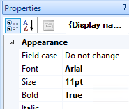
- Apply styles to the fields as required by clicking on each field and using the Properties window located on the right-hand side:

- Once you have completed this, you should be able to go to the preview and see the signature appearing similar to this:

- Now, go back to the Source tab. Add the IF statements here.
- Begin by adding the following code above the first div tag in your signature template. Change the width to be the required size for your logo.
<!--[if gte mso 9]> <TABLE class=ImprintUniqueIDTable style="WIDTH: 100%; BORDER-COLLAPSE: collapse" cellSpacing=0 cellPadding=0 border=0> <TBODY><TR><TD style="WIDTH: 60px; VERTICAL-ALIGN: top;"><![endif]-->
- Add the following code below the first div tag but above the second tag:
"border: solid 1px #808080; background-color: #efefef; border-radius: 5px; padding: 10px; font-family: 'Courier New', Courier, monospace;"> Insert code here </div>
- Next, add the following below the second div tag:
<!--[if gte mso 9]></TD></TR></TBODY></TABLE><![endif]-->
Note: Once this has been completed, you shouldn't see any difference in the signature template. It should look exactly as you left it in the design preview. This is because the Exclaimer template designer supports the <div> tags in the signature and should not have any issues. However, when you save the template and start testing, you will begin to notice that some clients will display the signature in a line, and some will display them stacked.
The clients that display them stacked - are the mobile devices, which are unable to understand the <!–[if gte mso 9]> and the <div style="float: left"> rules, which causes them to stack on top of each other.