Related Products: Signature Manager Exchange Edition | Signature Manager Outlook Edition | Template Editor
WARNING! From 1st April 2021 Exclaimer will no longer be renewing any Software Maintenance Agreement (SMA) for Mail Disclaimers.
Please be assured that the Exclaimer Support team will provide support until your SMA is active.
However, we recommend that you contact the Exclaimer Sales team to discuss your requirements for an upgrade to Signature Management Exchange Edition or Exclaimer Cloud - Signatures for Exchange.
Scenario
The signature design requires a specific layout, however, you are unsure of how this can be achieved. You know it needs rows and columns, as well as spacing between the elements in the design.
Resolution
Tables are a great way to build and control the signature design, using rows, columns and padding to add space and, give the signature template a professional feel.
The tables can be found at the top of the template editor window, under the table icon.

There are three different tables that you can use to create your signature template, they each have their pros and cons and ease of use.
Contact Block - A smart table containing contact numbers and email addresses, with labels and several layout options.
Smart Table - A smart table is optimised for common layout tasks, such as creating contact blocks, business cards and other groups of information. Smart tables are used with Active Directory fields with options to suppress the table row if the field is empty.
HTML Table - Used to create simple to more complex layouts, allowing total control of how the signature appears. It's also one of the easiest options to work with when building Email Signature Templates.
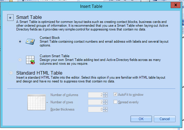
Contact Blocks
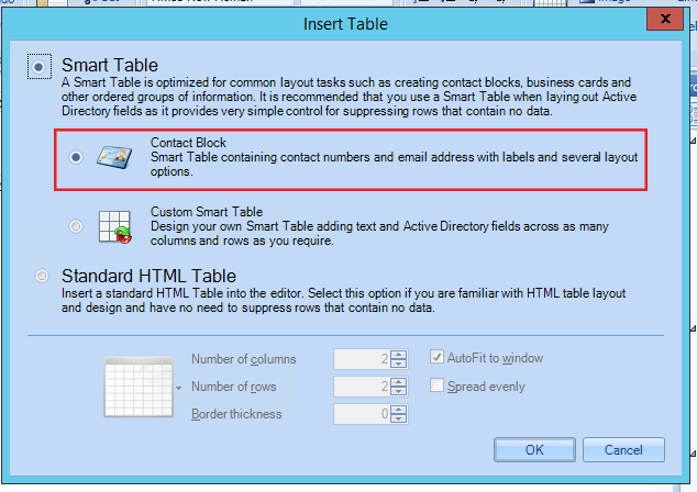
The Contact Block is automatically selected when opening up the Table selection window. It is a Smart Table containing contact numbers and email addresses, with labels and several layout options. It is the first in the list of the Smart Table category. You can style the fields using the field properties while creating the contact block. Also, by using the table properties you can create space and apply further formatting if this is required.
To create a Contact Block:
- As a first step - click OK.
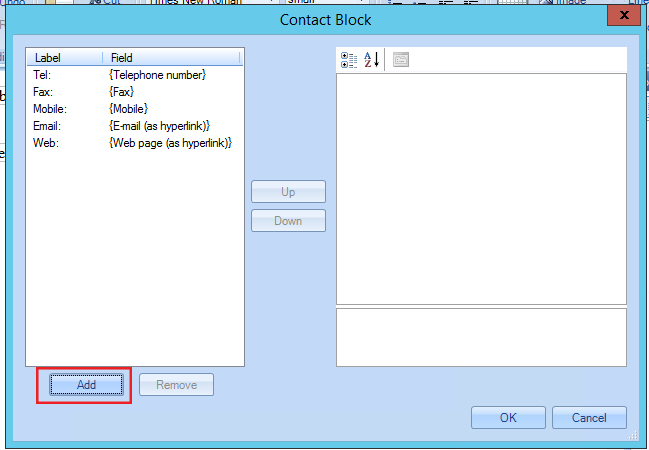
- This will open another window from which you can select the fields you would like to use; such as Telephone Number, Fax, Mobile, Email as hyperlink and Web page as a hyperlink - these are usable fields.

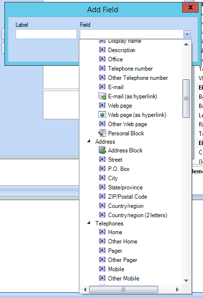
- However, you can click on Add to select further fields using the drop-down arrow in the field box.
- The Field drop-down displays all the available fields that you can use, in the Contact Block.
- If required, you can edit the fields or leave them as they are.
In this view, you can move the fields up and down or remove the ones you do not need. The label is already set, however, you can change it - the field is also set to hide if the field is blank in the Local Active Directory.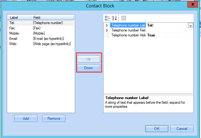
Font Styles and Field Properties
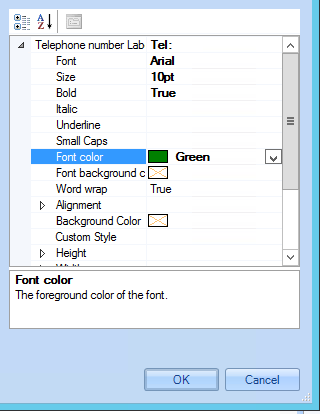
- Click on the arrows near the Telephone number Label and the Telephone Number field. This will allow you to style the fields with fonts, colours, font sizes and so on, this will then be replicated in the preview of the signature itself.
This is the default layout of the Contact Block, with the fields tabular and close to the labels.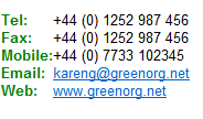
Table Properties
Table properties allow you to have further control of the formatting, styling and display of the contact block. The properties are displayed on the right-hand side, once the contact block has been clicked on.
- Here you can set the Appearance, which controls the fonts and sizes of the block, however, if you have set the fonts on the fields, this will be left empty.

- In the Fields category, you can edit the font and font styling of the fields. Each drop-down arrow expands the label and field for further editing.
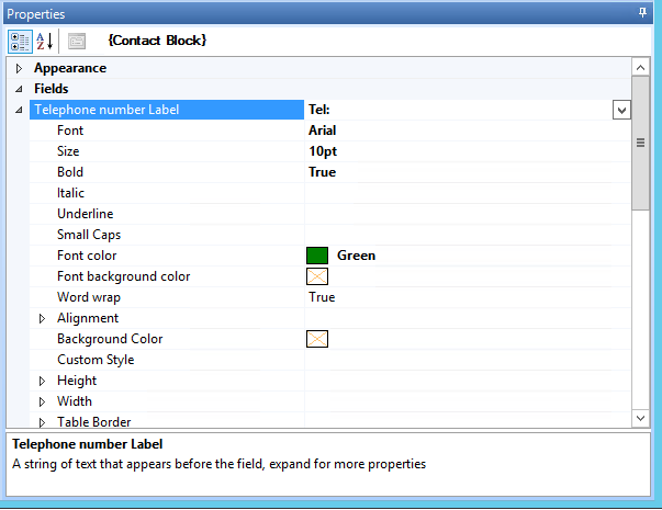
- By expanding the fields, you can see the fonts and styling used here.
You can also add spacing to the cells by using padding, in Custom Style. In each of the labels, with the code padding-right: ; with a px value inserted.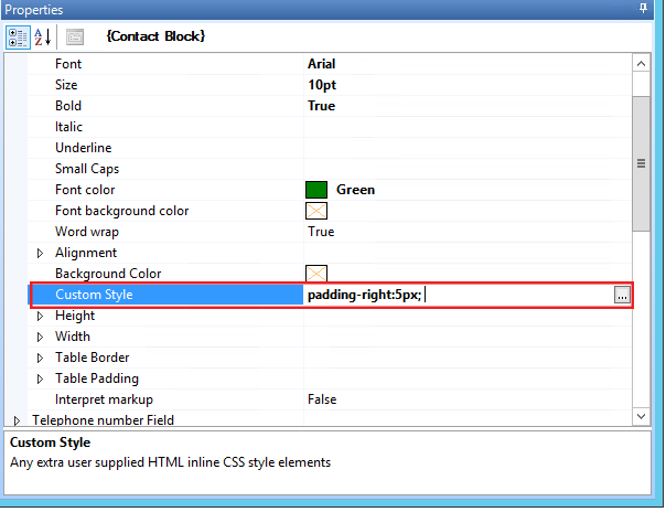
- In the Layout category, under Arrangement, you can control how the fields are aligned and displayed in the design used.
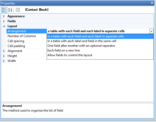
This table displays the different options in the Arrangement field with examples:
| Arrangement | Example of how this displays |
| In a table with each field and each label in separate cells |  |
| In a table with each label and field in the same cell |  |
|
One field after another with an optional separator |
|
| Each field in a new line |  |
| Allow fields to control the layout |  |
